shattering!
Posted in
Tuesday, 16 March 2010
this was the initial step in shattering a glass, were shattering this for our ident project, this was just to see how the glass would behave and so on
this is a lot more advanced on from the other playblast, however this is without shadows and looking quite flat, the glass was shattered into just under 800 pieces, and looks really sweet.
and this is more along the lines of what i was looking for, its going to be a lot brighter and look more stunning in our piece, but for now, this is what i wanted, it looks good, shatters nicely, and reacts properly with the environment
Concept For Lip-Sync
Posted in
Friday, 19 February 2010


Here is my conceptual idea for my lip-sync, my idea is to take a skate board thats being fixed on a desk, where there is a stationary pot, with a pair of scissors in it, and im going to have the skateboard and scissors talk, blink, and mover their eyes.
the background for this is a shop, so there will be your average till and items in the background, but the main foreground is going to be a wooden desk.
im going to use audio clip 2, as listenign to them all, they all seem quite boring as such, but kind of liked number 2.
originally i wanted to do animals, as in like creature comforts, but then realised how many people were doing animals, then thought okay, im going to do inanimate objects, as it will make me stand apart a bit and be the same old thing.
i will be honest, im not 100% happy about working in flash, i don't really like it, but it is a programme that can be used for many of things, so no reason not to learn it. Im not a very artistic person, i like having a drawing of something and turning it into a 3D model, then going through that whole process, thats what i want to learn as much as i possibley can about, but having a variety of knowledge in different programmes is no really a bad thing.
i found my mouth shapes off of google, and slighly changed the shape of the lips and teeth as to make it a bit more unique. my next step is to draw these characters in flash, get the different mouths drawn, then start listening intensly to the script and making the movements.
im also only going to use 4 drawings for the eyes blinking and it will be at such a fast speed it shouldn't jump and look odd.
3 Long Days In The Studio
Posted in
Wednesday, 17 February 2010
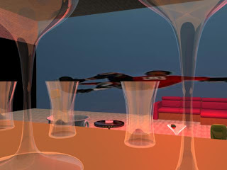
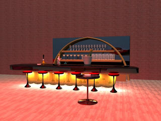
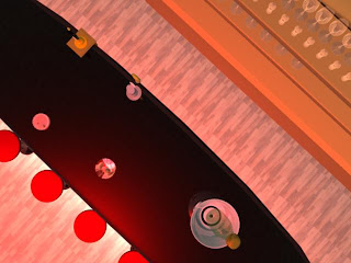
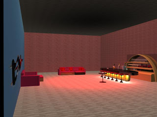
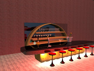
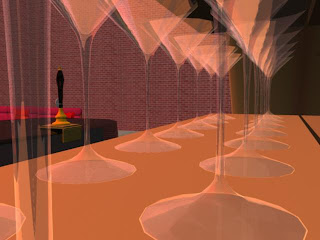
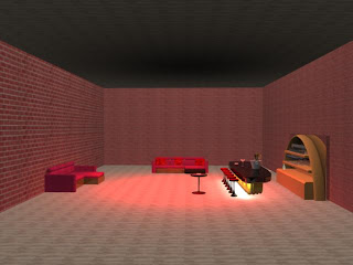
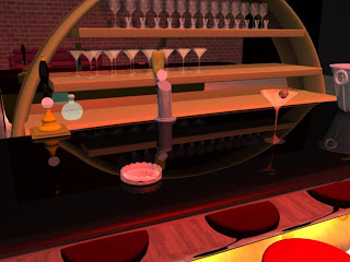
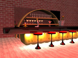
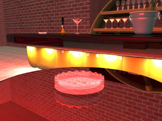
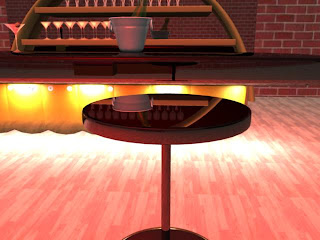
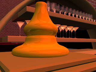
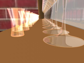
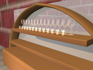
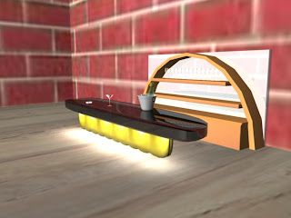
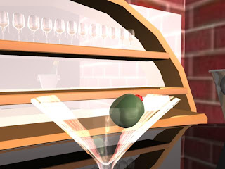
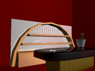
Okay, The 3 of us have been in the studio all day for the past 3 days, and produced the basis of our room for our Virgin Ident, it is a test room as of yet, but im so happy with it, i havent produced 3D work to this standard as of yet.
The pictures are in order, from when we started to the end of the 3rd day, we had a very efficient system running.
We began working on the idea, and all began modelling something each, after which we digressed off into certain things we were making for the bar area, kai began making glasses and furniture, liam began making bottles and furniture, and i began by making the actual bar and room, then i made the shelves.
we thought it would be a great look if there was a mirror behind the shelves, which after a bit of work, is now a mirror. Also i spent a long time time trying to make glass look real, in the end we ended up using a Blinn, but it still has given a nice result...for now anyway, i would like to improve on it.
This is also the first time i have played with lights and the UV texture editor, and i fell into the snowball effect, got excited, overlit everything, and over textured things and it looked awful. After steppign back and looking at it, i went back in and started changing things, was got rolling with it.
All in all we have worked fantastically together, weve all inputted ideas, talked about ideas, and made contributions, i have also very much enjoyed making this.
Posted in
Tuesday, 16 February 2010
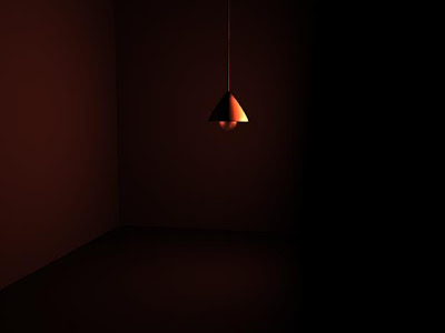
Today, we began building our idea for our IDENT, which is for Virgin's Redrooms, working ina team of 3 we have come up with a strong idea, and our main feature were doing is making everything crisp and clear, highly detailed and hi-res! but there will be more to come on this as we get further with it!
Live@5 Day!
Posted in
Monday, 15 February 2010
After arriving in the studio to begin working at 9 o’clock, I found myself to be the only person their, then after double checking the time on moodle I noticed the time had been changed from 9 to 10. After Pete showed up it was between me and Nigel to decide who was the producer, and I took on the role.
I really enjoyed having the responsibility, I work well under pressure, making quick decisions etc. after collaborating with the Live@5’s producer on what graphics they wanted, we began work, I had four team member and set them going on different graphics each, my reasoning for doing this was I am confident with after effects, so I could float around and tweak the graphics as they were being made, and be there for help if it was needed.
We had to have the graphics ready for 2 o’clock, and we had them done by 12:30, so we had nothing else to do, I asked there producer if they would like any more things done and he said they were set, so we had a lunch break, after returning Pete asked us if we would make the World News graphics, which having 5 hours or so to kill, we did, and I again I set the team on different graphics and helped out were I was needed, keeping a close contact with the producer.
The World news crew were very appreciative and happy with what we made, and they seemed a lot more organised with what they wanted, for starters they gave us a specific description of they wanted, which made making it clear for us, however the Live@5 crew expected us to just come up with them, which did at some points feel like we were banging our heads against a brick wall, and then they gave us criticism for our graphics, and I replied by telling them to be more clear with what they want in future, to avoid making their show look amateur. Them seemed to take the advice onboard.
The graphics I made for the show was the surf report and the football score table, and I was disheartened with what I made, I could of made it so much better and more visually stimulating, but they kept telling me to leave it plain, bland with no transitions whatsoever, this made their news report look dull, it didn’t complement anything they did, so it was a bit of a shamble, but the client is always right.
They also tried to tell us about mistakes in the Aston’s, which was their error on the notes they scribbled down for us, which there lecturer gave them a talking to about, saying they weren’t allowed to blame graphics for their simple mistake. We didn’t really face any major obstacles throughout the day, the only problem we had was with the communication with the other crew, which admittedly got quite frustrating but we pulled through by using our own ideas as a group on what it should look like, as they gave us terrible guidelines of what they wanted from us.
The surf report I made used a piece of stock footage from the video compositors tool kit, which was a beautiful HD slow motion water movement, with a table over the top showing the tide times, it was all made in After Effects using simplistic tools and took mo time whatsoever, and the football table, in my opinion was disgusting, it think they needed it quick because they were behind on editing their package together, but still, in the time I had, I could of made something more professional, but once he saw the start of it, the basic building blocks, he told me to put some colour on the words “Falmouth Town” and then he would just use that, I was gobsmacked at the lack of professionalism within their work.
They didn’t seem appreciative of anything we done for them, which bugged me a bit because we tried to give them something good, and they were snatching it away from us before we could make it to an industry standard, which is what I wanted my team and I to achieve.
We had a fantastic title strap built, which most of the credit for it goes to Sasha, but we had a great animated title strap, and it was ready for them at 12, I rang and told the producer all 8 straps were ready and to come and pick them, he replied he would be up straight away, an hour and a half later he came to collect them, by the time he got it to their avid studious, it was to late for them to add it to the packages, so we had to cut them down to jpeg’s, cut the effects off of them, and then leave them plain, and there editors slapped them on the screen live, and it looked awful, no subtlety to it at all.
I feel my team and I really worked well together throughout the day, we kept high communication with each other, we all chipped in on everything, everybody gave ideas and we expanded on them as a group, I felt I lead very well and hit the ground running. I think we were the first group so far to get the live@5 and World News graphics done, which is a nice feeling to know that we pushed ourselves, I expected a lot from my team and got more, and I am very proud of the day.
All in all today made me question what I believe to be a industry standard of work, I believe everything I make should be good enough to se on television, and should look the part, I could never be happy settling for something I know could be better, but maybe I am working at to much of a high standard already, or maybe I am setting my goals to high and overcomplicating things, but then again, this is my learning style, I set myself challenges, I wouldn’t get that great sense of achievement if I didn’t reach what I first that to be a unreachable goal.
High tide Graphic
Posted in
Here i built the background for the graphic for the live@5 MA team, the graph was built by someone else and i gave it the moving background and the white tint, using after effects and doing some basic keying allowed me to do this, it was fun, but i used hi-def stock footage from the compositors tool kit, which meant i didnt have to film anything myself.
Posted in
Labels:
pastels
Friday, 5 February 2010
Subscribe to:
Comments (Atom)


